Swiss Pro Boxing
2025
2025
Industry
Role
Scope
Website
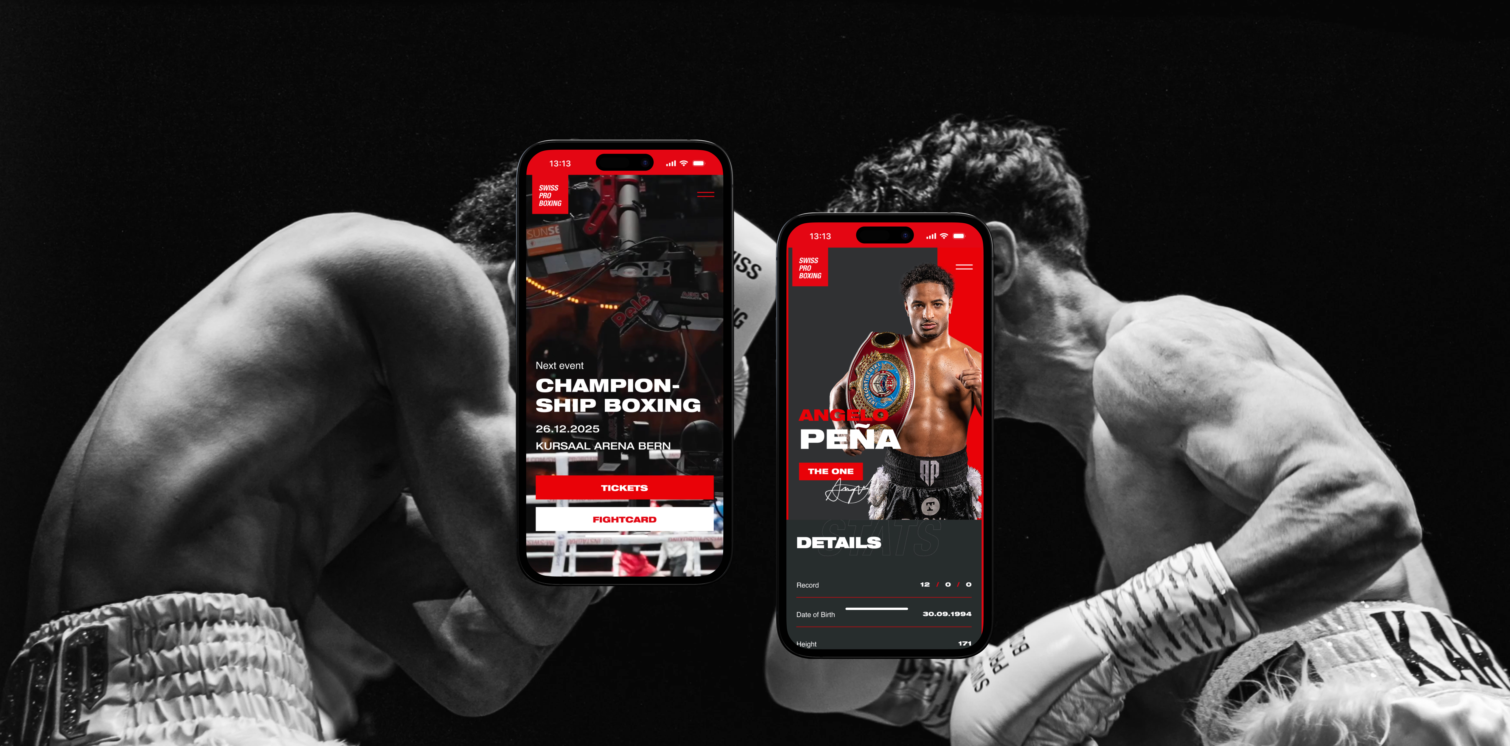
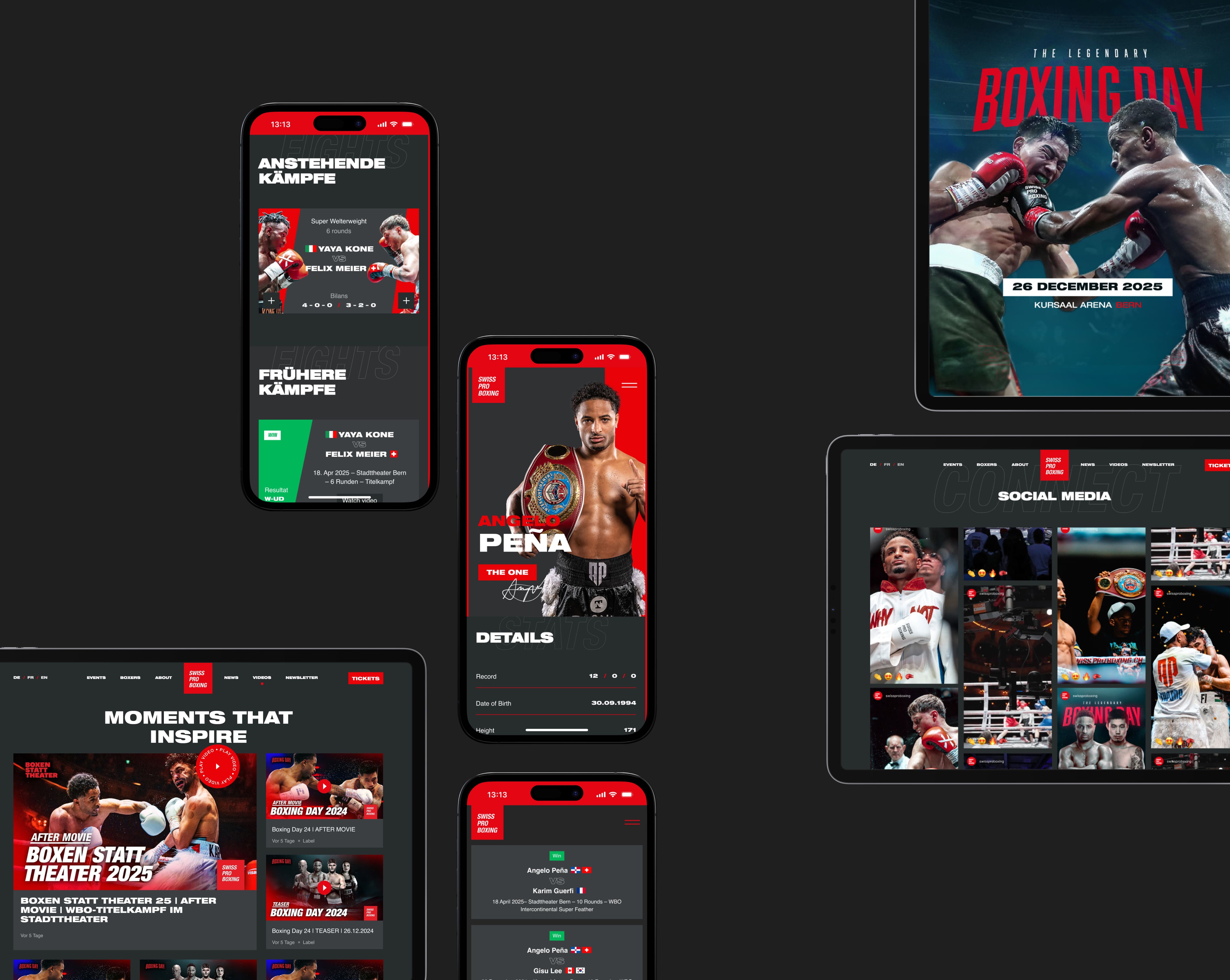
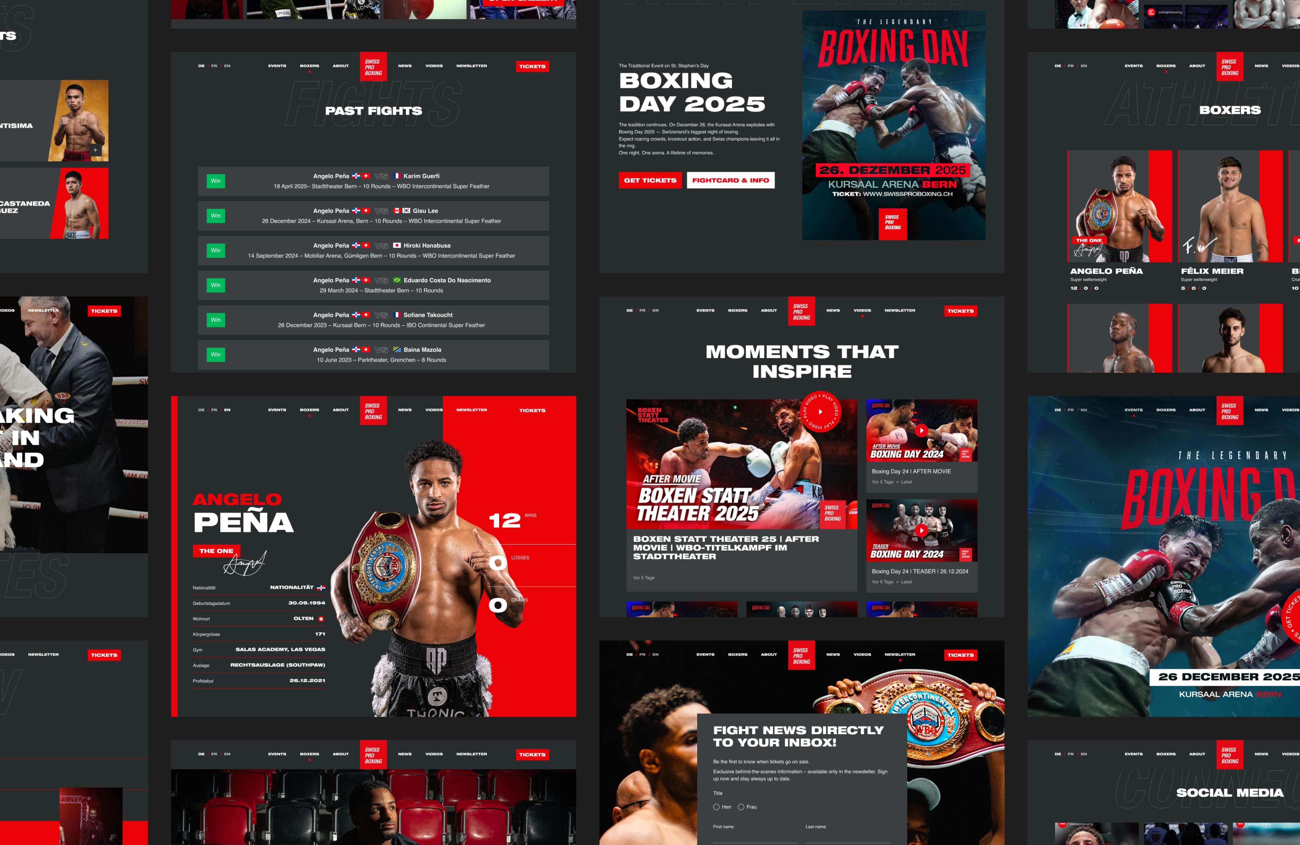
Swiss Pro Boxing produces cinematic live boxing events with international fighters and premium partners. The physical experience is disciplined and intense, and the digital experience needed to move the same way. Working at Dunkel, I helped shape the website into a hub that connects platforms, expresses the brand in motion, and works naturally on mobile. The result is a site that doesn’t just announce fights, but participates in them.
Introduction
Swiss Pro Boxing is the leading professional boxing promotion in Switzerland. Its events are intense, cinematic, and carefully produced. By 2025, they attracted international fighters, premium sponsors, and a global audience through streaming platforms.
The website hadn’t kept pace. It worked as an information layer, but not as an experience. It didn’t reflect the movement of the sport, and it didn’t connect the growing ecosystem of platforms surrounding it. My role was to help reposition the website — not as a static destination, but as a living hub.
A place between platforms
The website sat in the middle of a fragmented ecosystem without connecting it. Fans moved between YouTube, BoxRec, TrillerTV, and social platforms, while the site functioned in isolation.
The redesign repositioned the site as a hub. External platforms were orchestrated rather than replaced, with content structured around fighters, events, and live moments. Mobile behaviour shaped the experience, keeping key actions within thumb reach and information easy to access mid-event.
The result was a cohesive flow between information, hype, and action. The website stopped acting as an endpoint and started working as connective tissue.
The Collaboration: LS Creative x Dunkel
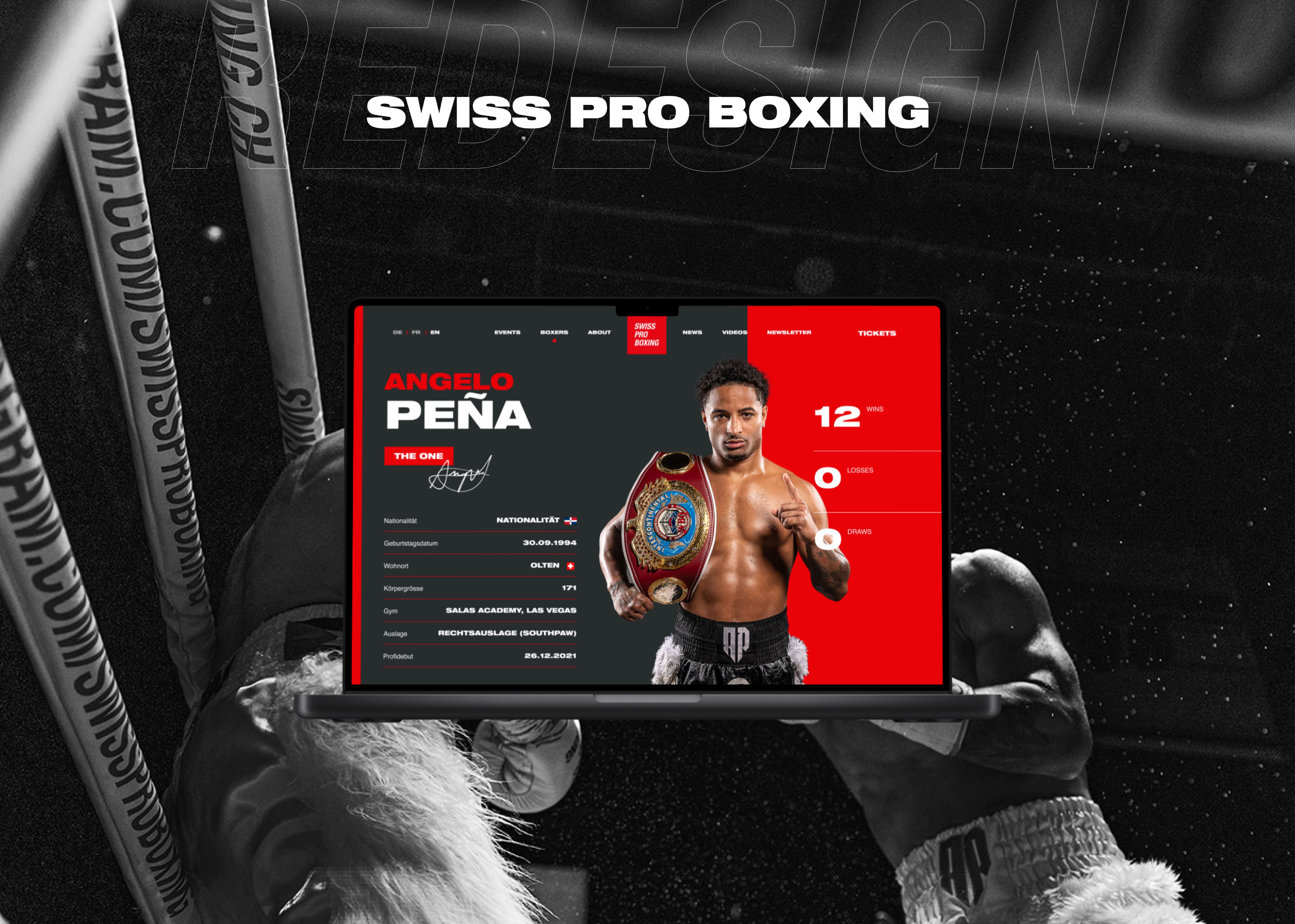
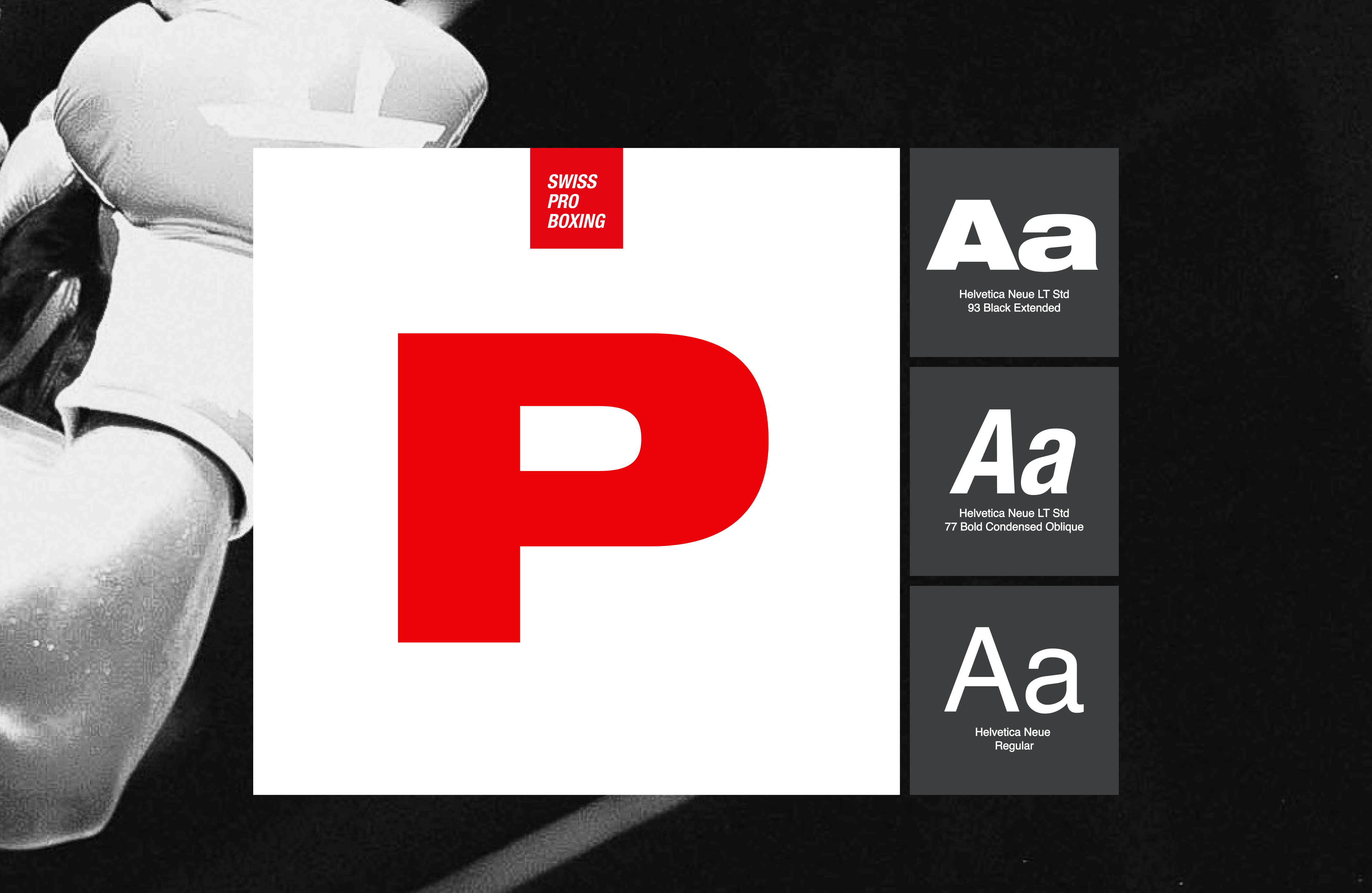
The visual language was a collaboration. The brand itself — logo, typography, tone, and restraint — had already been carefully defined by LS Creative. My role wasn’t to reinvent it, but to translate it.
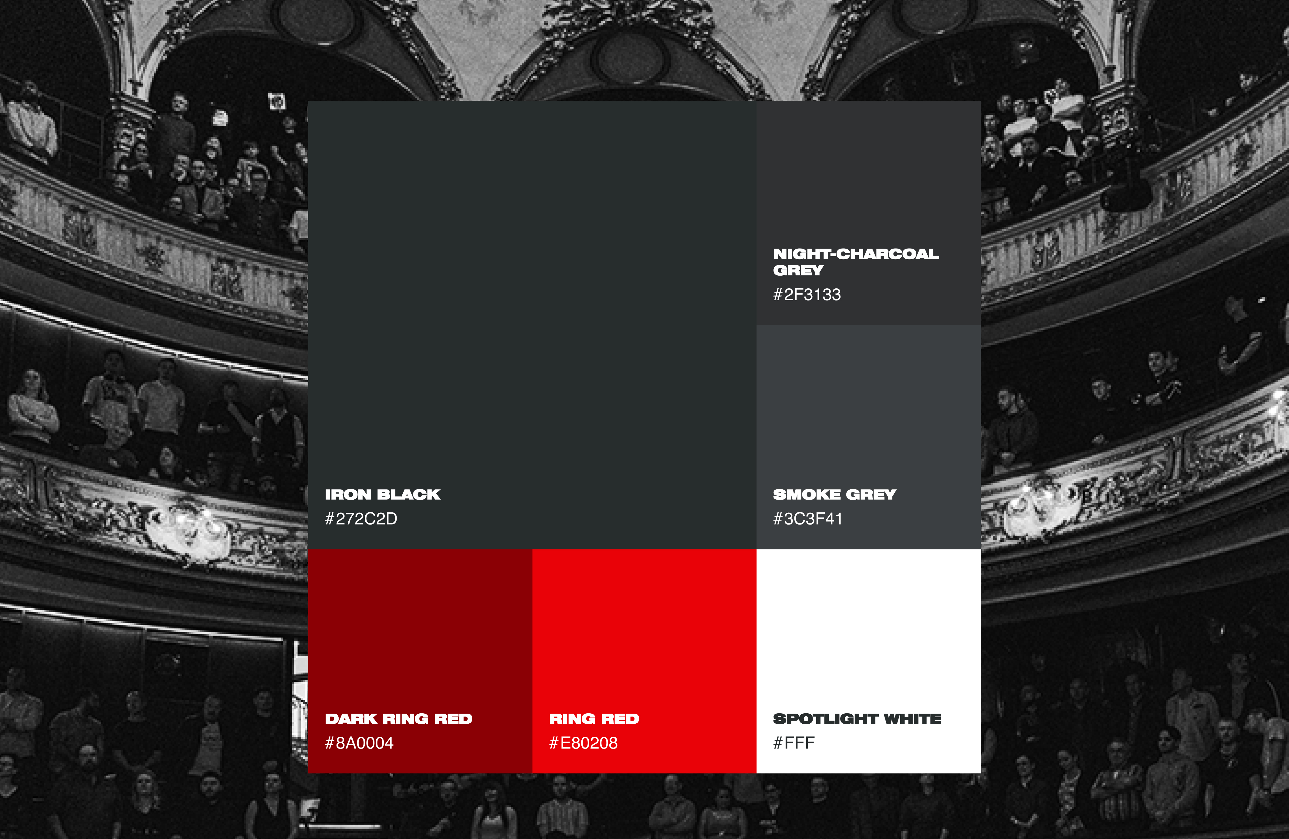
The brand manual was designed primarily for print and physical spaces. The challenge was to make that identity function on screens, in motion, and across devices. Dark, high-contrast surfaces were carried into the interface to create a cinematic baseline and give fighter imagery physical presence. Typography was adapted for digital use, preserving its condensed, assertive character while adjusting spacing and hierarchy for readability.
Interaction design added rhythm where print could not. Subtle motion, transitions, and pacing helped the interface breathe without distracting from content. Mobile responsiveness shaped these decisions from the start, with layouts designed for thumb reach, fast scanning, and contemporary usage patterns.
The result is a visual system that remains restrained, but no longer static — one that feels consistent with the brand in physical space while fully at home in a modern, mobile-first interface.
Thank you for watching!