Gymnasium Lerbermatt
2025
2025
Industry
Role
Scope
Website
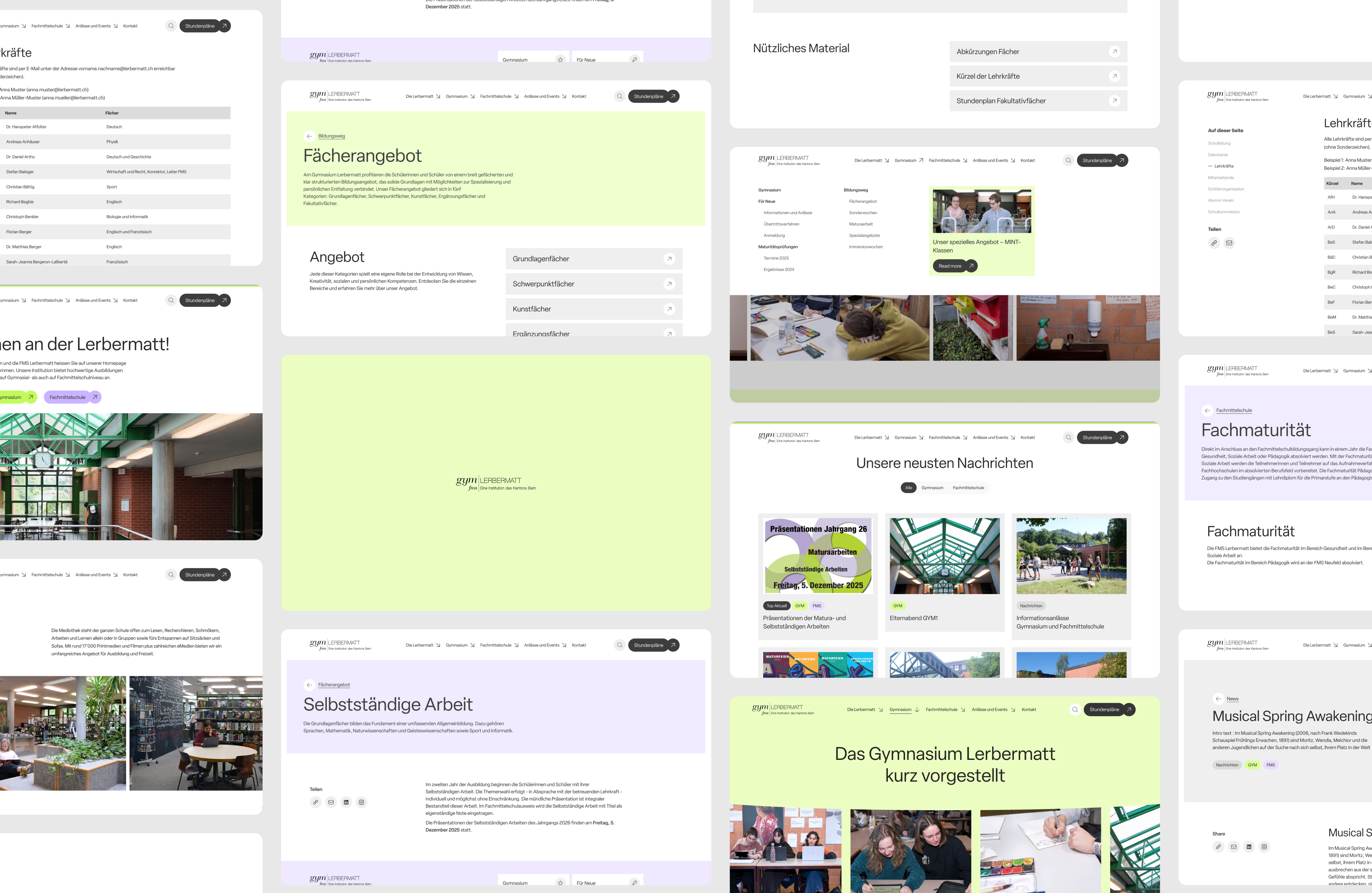
Gymnasium Lerbermatt is a large dual-track secondary school in the Canton of Bern serving students and staff across Gymnasium and Technical School (Fachmittelschule) programs. The project involved modernising the school’s digital presence while establishing a clearer and more consistent institutional identity.
Introduction
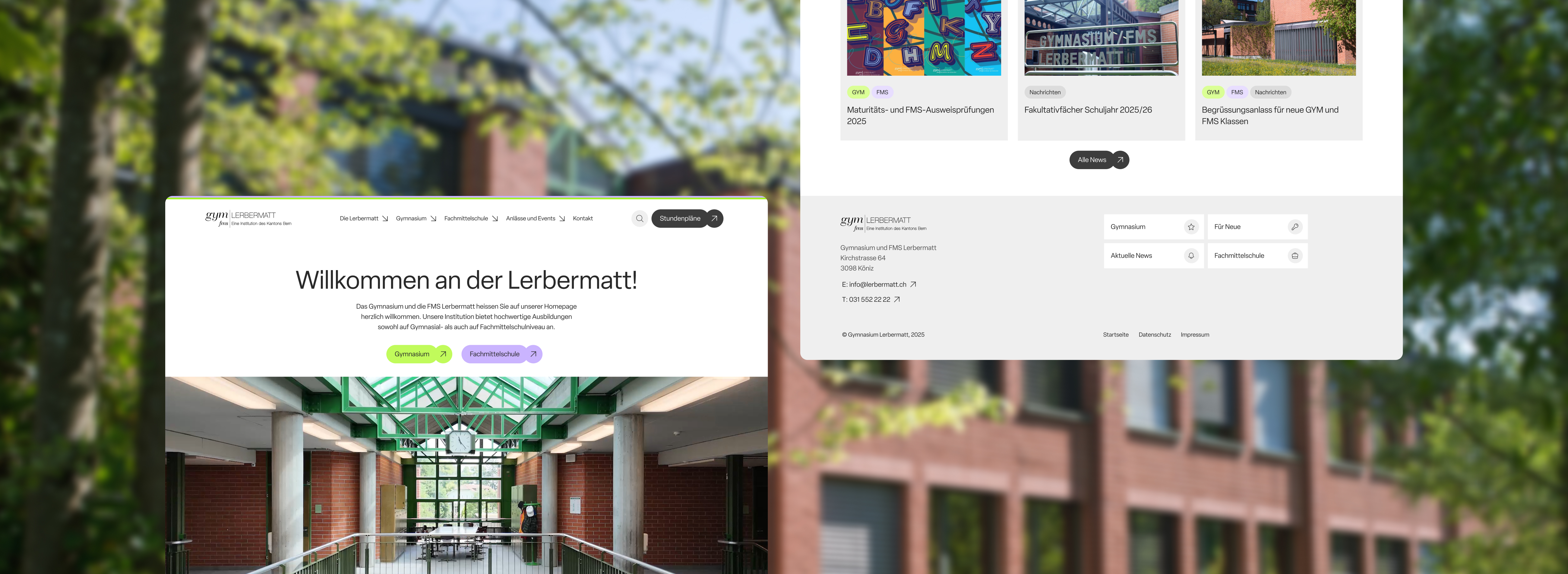
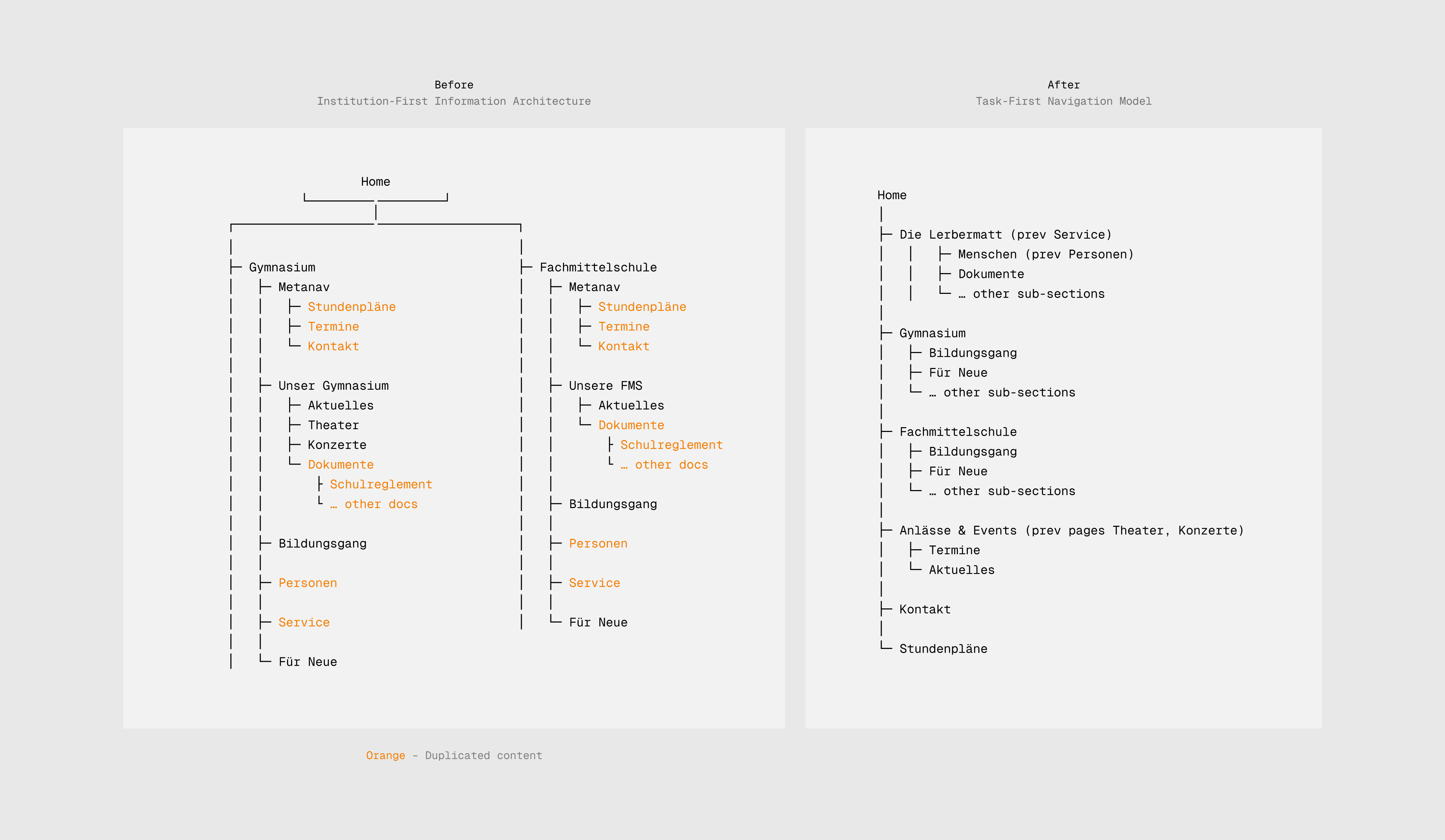
The legacy Lerbermatt website was organised around institutional silos and PDF-centric content, forcing users—especially mobile-first students—to navigate by school track (either Gymnasium or Fachmittelschule) to accomplish basic tasks. In parallel, the visual identity had evolved inconsistently across digital and printed materials, weakening recognition and coherence.
My role was to rethink the information architecture and responsiveness of the site while also helping to clarify the school’s brand identity. I led multiple visual design iterations to establish a consistent, functional visual language and formalised it through brand guidelines applied across digital and marketing materials.
Reframing a School Around User Tasks
The legacy information architecture required users to understand the school’s internal structure before completing basic tasks. Everyday resources such as timetables, events, and regulations were buried behind track-specific navigation, duplicated across sections, and often locked inside static PDFs. To reduce this institutional friction, I introduced page “Die Lerbermatt” as a shared entry point for cross-school content while preserving Gymnasium and Fachmittelschule as first-level sections for curricular depth.
High-frequency tasks like Stundenpläne and Anlässe & Events were elevated to the global navigation, shifting the experience from institution-first to task-first. As a result, users can now access daily utilities directly, navigate with fewer decisions, and find information without needing prior knowledge of the school’s organizational structure.
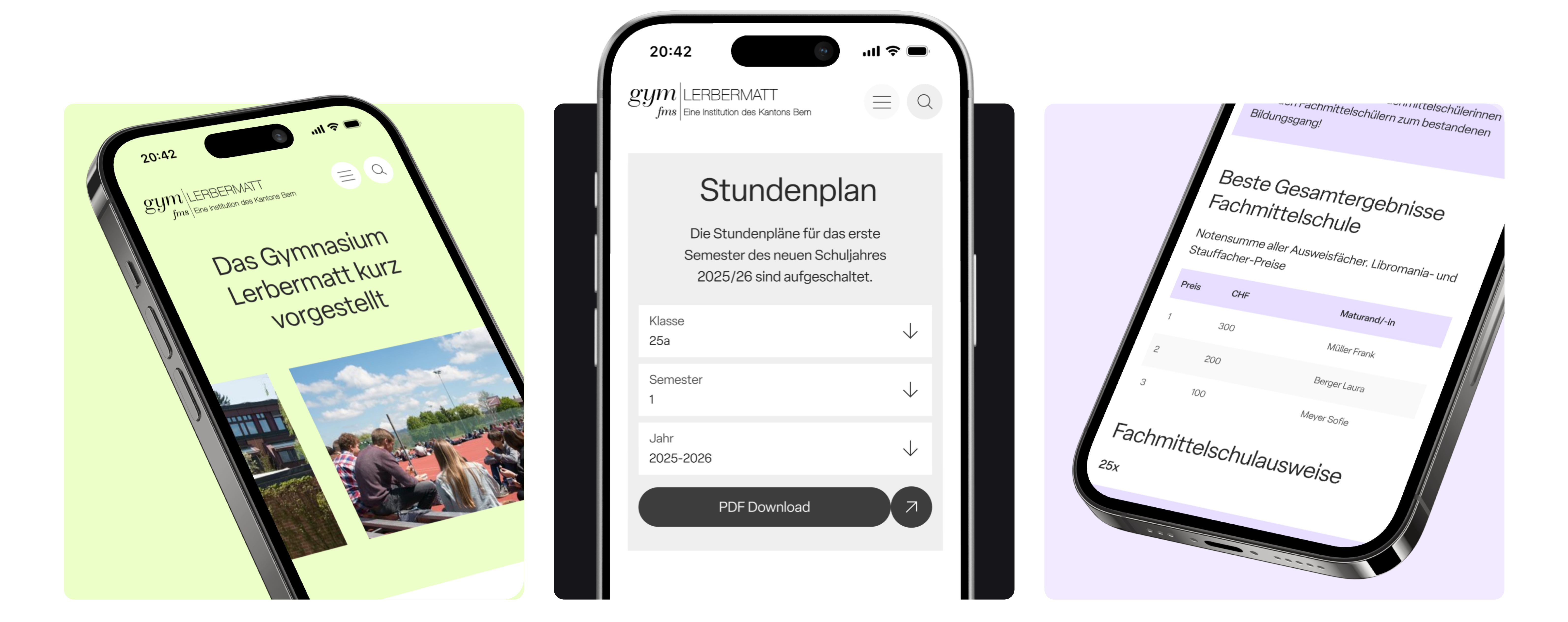
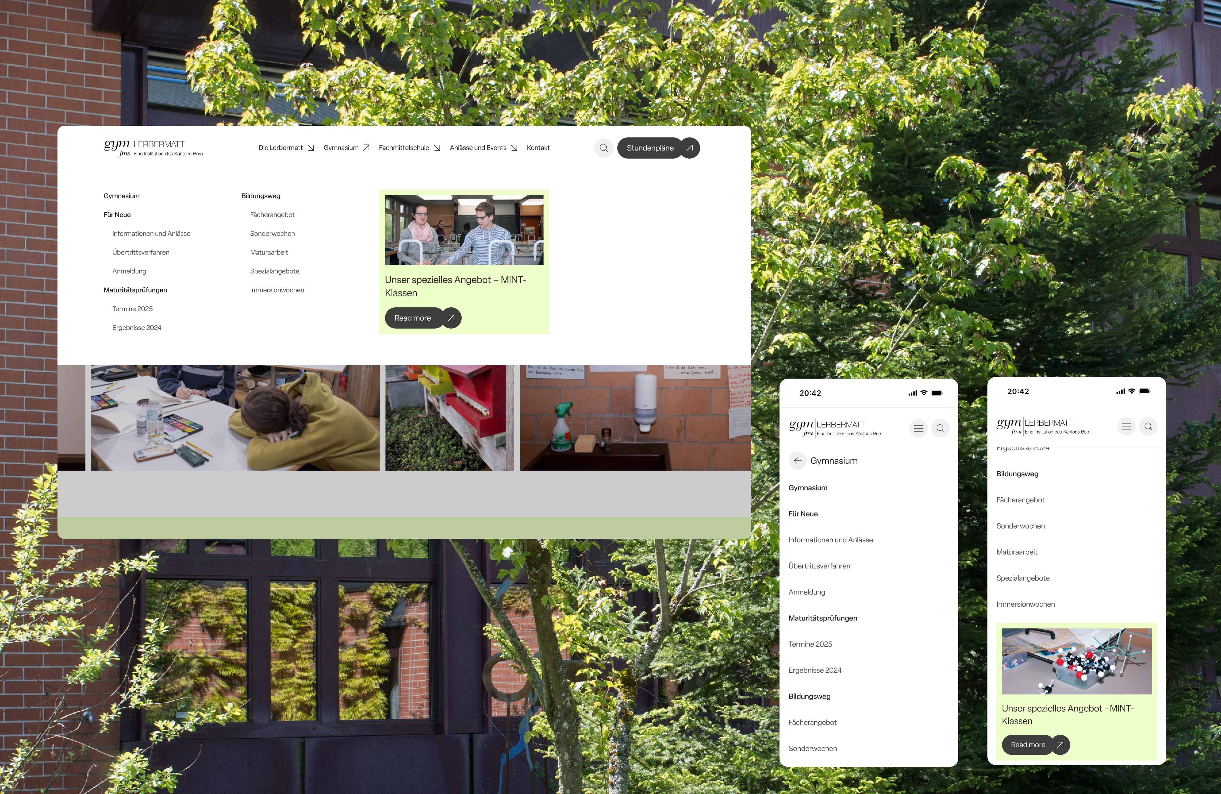
Rebuilding the Experience Around Mobile-First Use
Although the majority of users accessed the site on mobile devices, the legacy experience was shaped by desktop-first layouts and static documents that broke down on smaller screens. To address this mismatch, I identified mobile-critical content and workflows and redesigned them using responsive, browser-native layouts instead of fixed PDFs wherever possible. Flexible templates and components were introduced to ensure consistency across breakpoints, allowing information to adapt fluidly to different screen sizes. This shift resulted in a more coherent experience across devices, reduced interaction cost for mobile users, and improved access to daily-use information in real-world contexts.

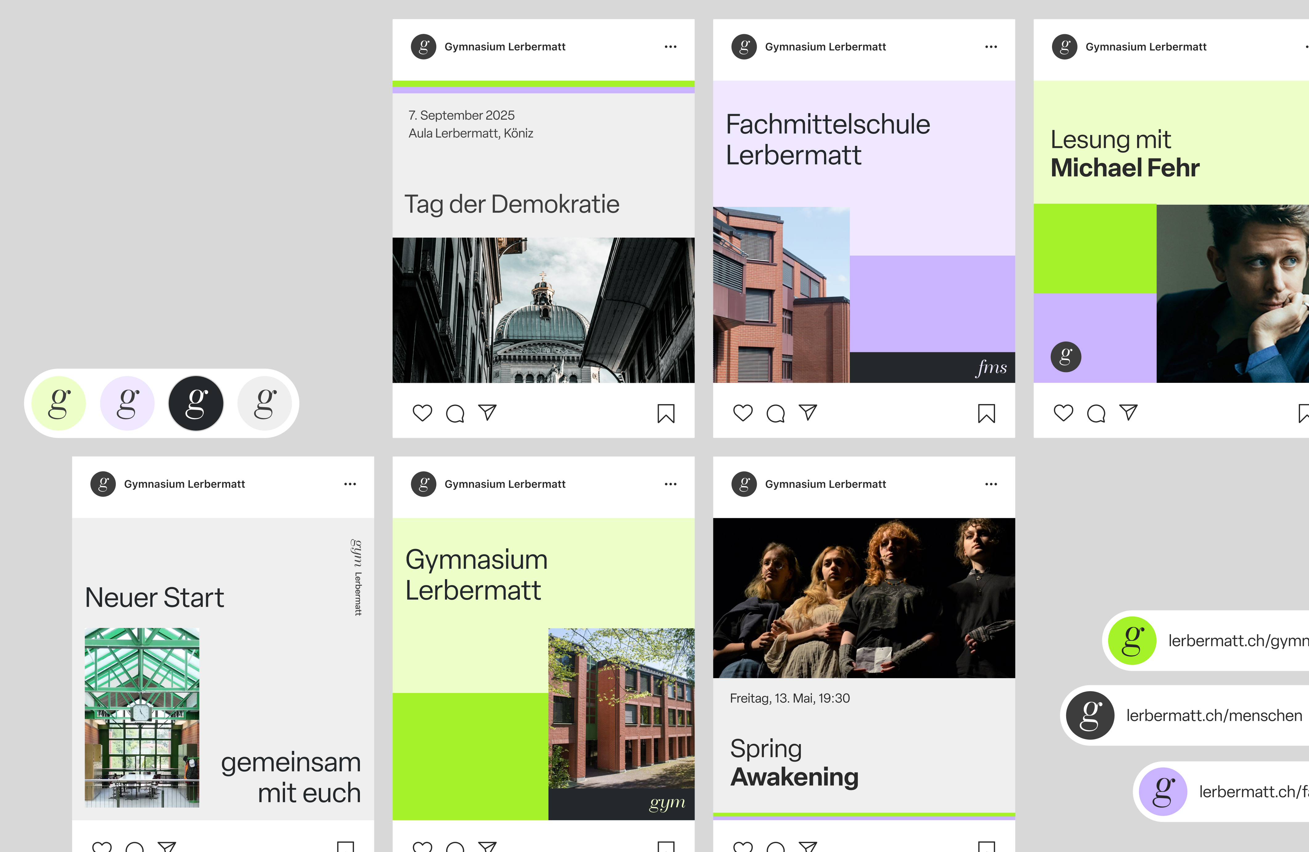
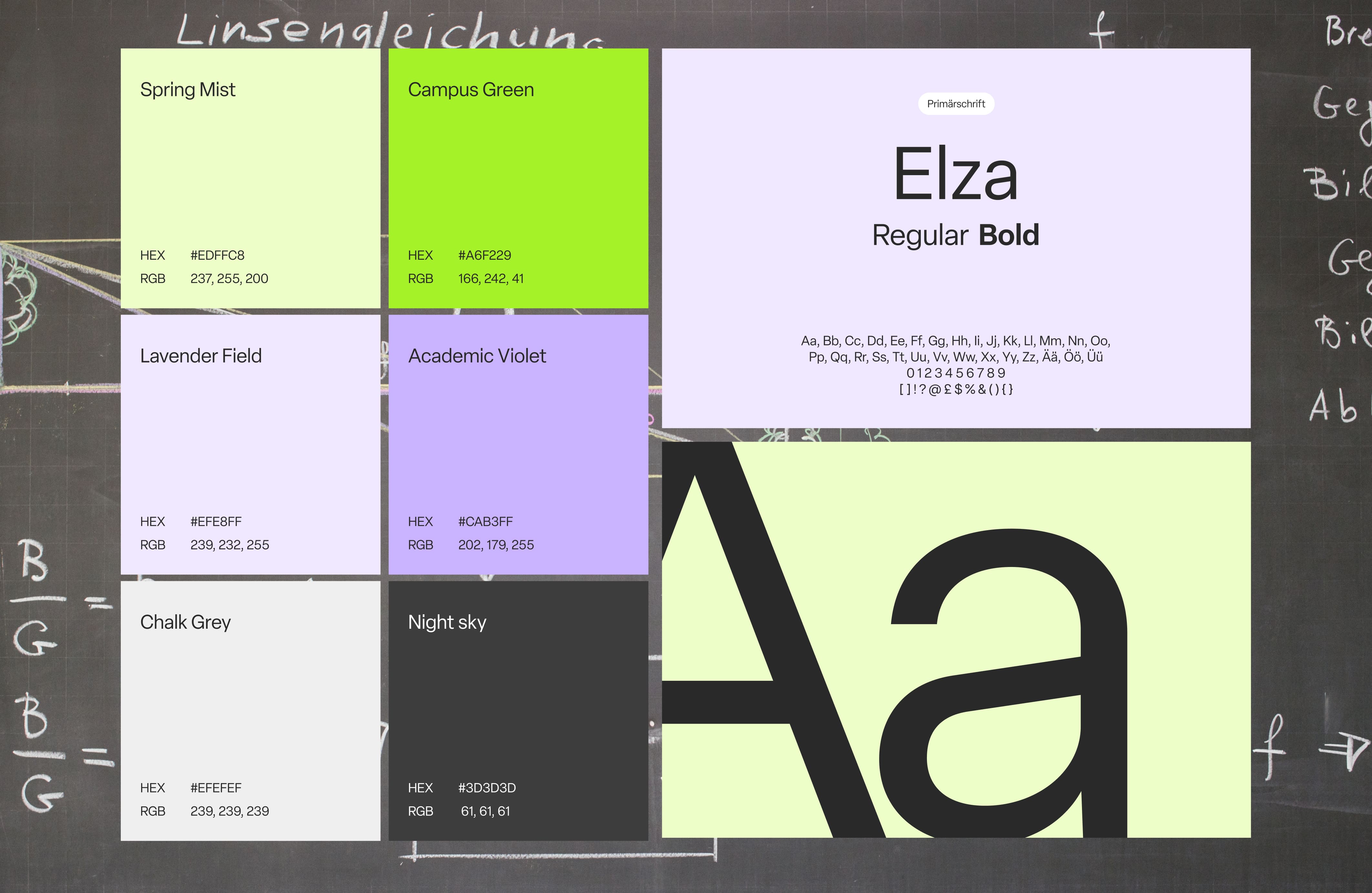
A Visual Language Built to Scale
Alongside structural improvements, I developed a clear and consistent visual language to represent the school as a unified institution while preserving distinctions between its two tracks. A restrained, functional design system was defined, using green to identify the Gymnasium and purple to distinguish the Fachmittelschule. The system covers typography, colour, layout principles, and reusable components, and was applied consistently across the website as well as social media assets and newsletter templates. This approach strengthened institutional recognition, ensured visual coherence across digital and printed touchpoints, and created a scalable foundation for future communication.
Thank you for watching!